A Creative Data Story About Periods
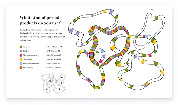
What does menstruation really feel like — and why don’t we talk about it more?I led a survey with 75 participants to explore the personal, emotional, and social layers of the menstrual cycle. Inspired by Giorgia Lupi’s poetic approach to data, I turned each question into a custom visualization. The result: a hand-coded, animated one-pager that makes space for a topic often left in the shadows — and invites viewers to see it with new eyes.


I conducted part of the survey analysis manually, using paper to map out responses, group findings, and identify emerging patterns.At the same time, I began exploring how the topics and results could be translated into visual form. Through sketching and quick composition studies, I tested ways to structure the information and experimented with graphic metaphors that could reflect the survey’s themes in a clear and engaging way.